ESTABLISHING A TYPEFACE
I am enamored by California’s beauty and have been extremely inspired by all the beach culture. I thought it would be fun to take a look around at some items in my neighborhood that might inspire my personal typeface. I focused on choosing between a really fun palm tree in my neighborhood, my paddle board, and this cool seashell I found in a garden on the neighborhood walking path.
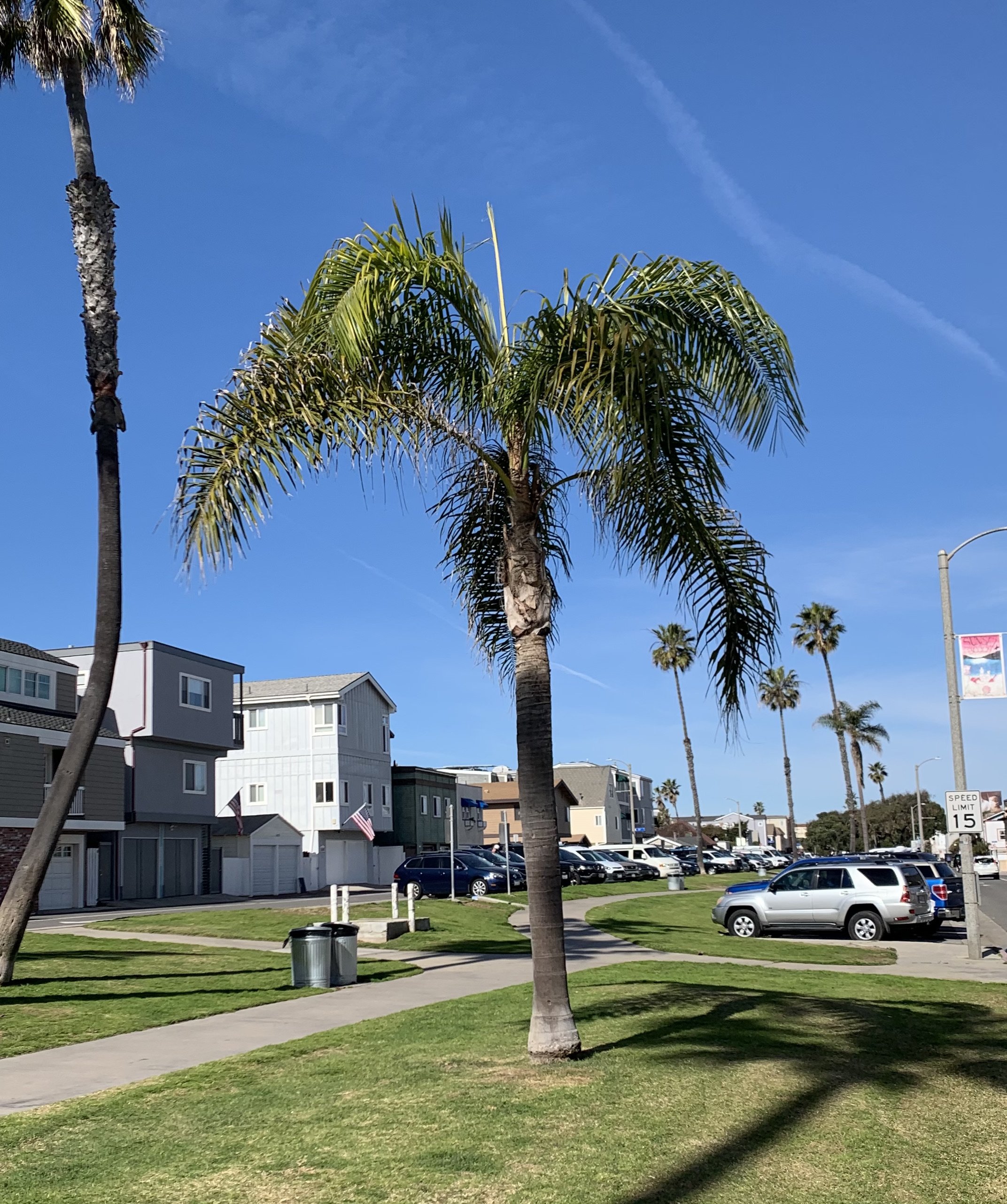
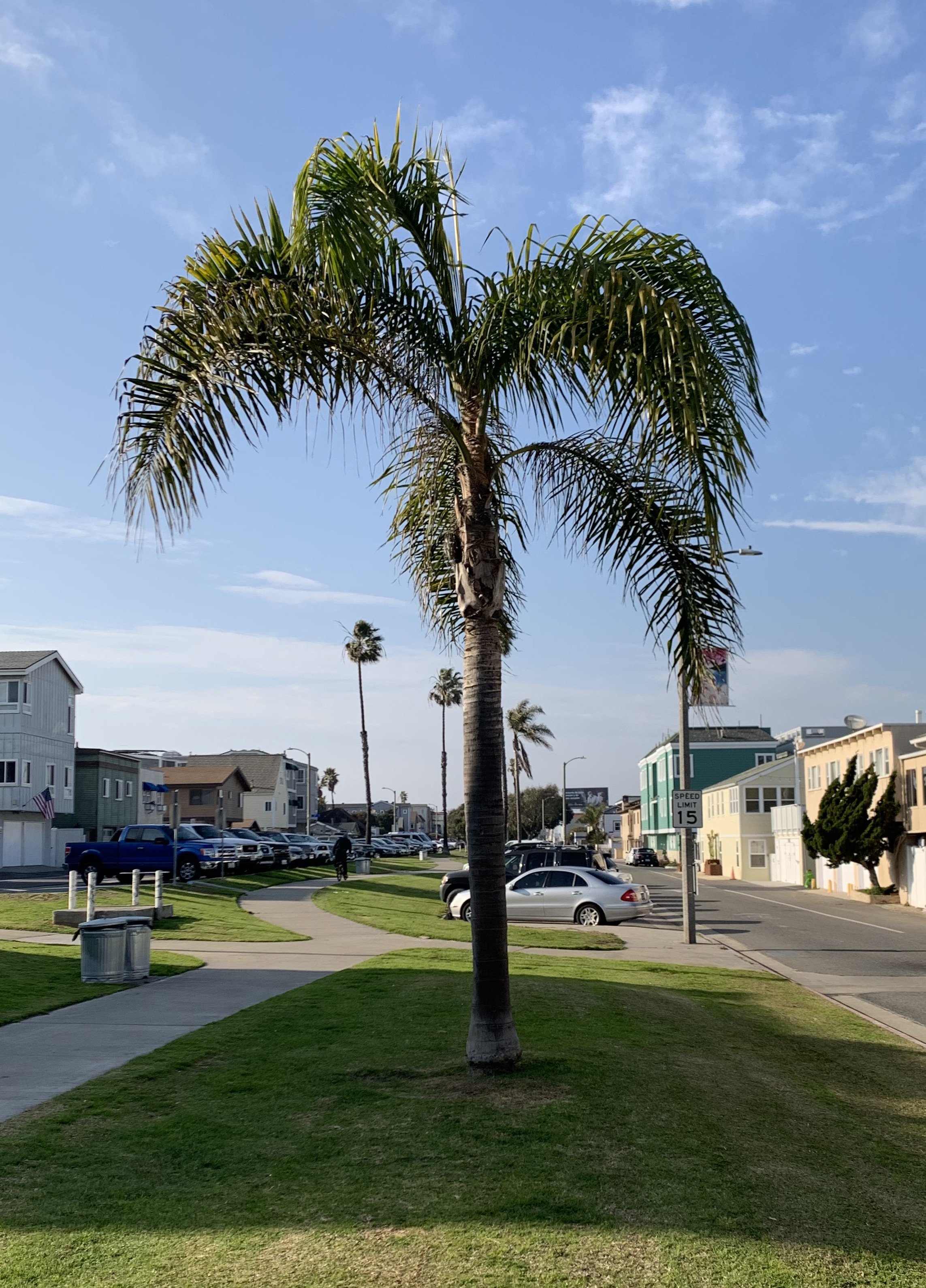
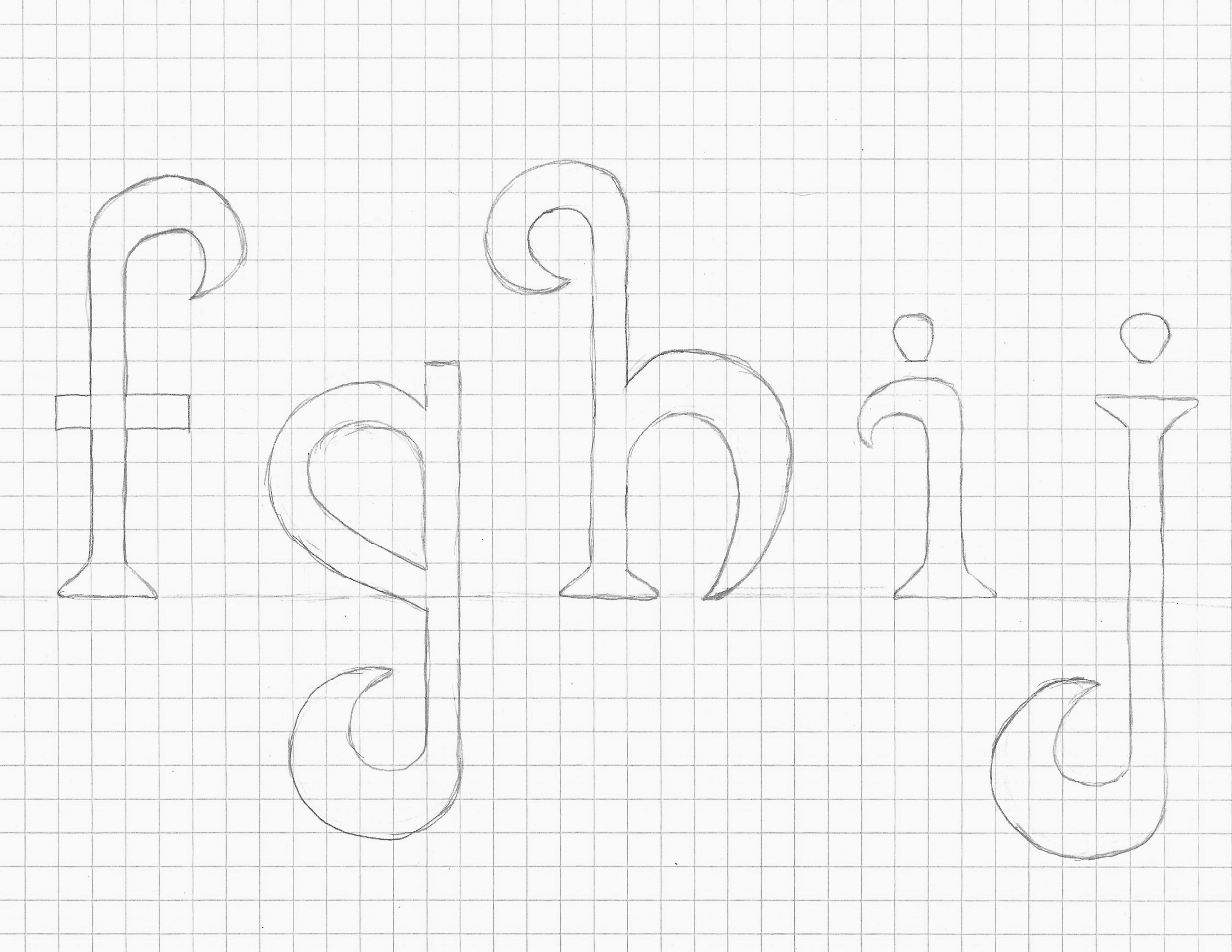
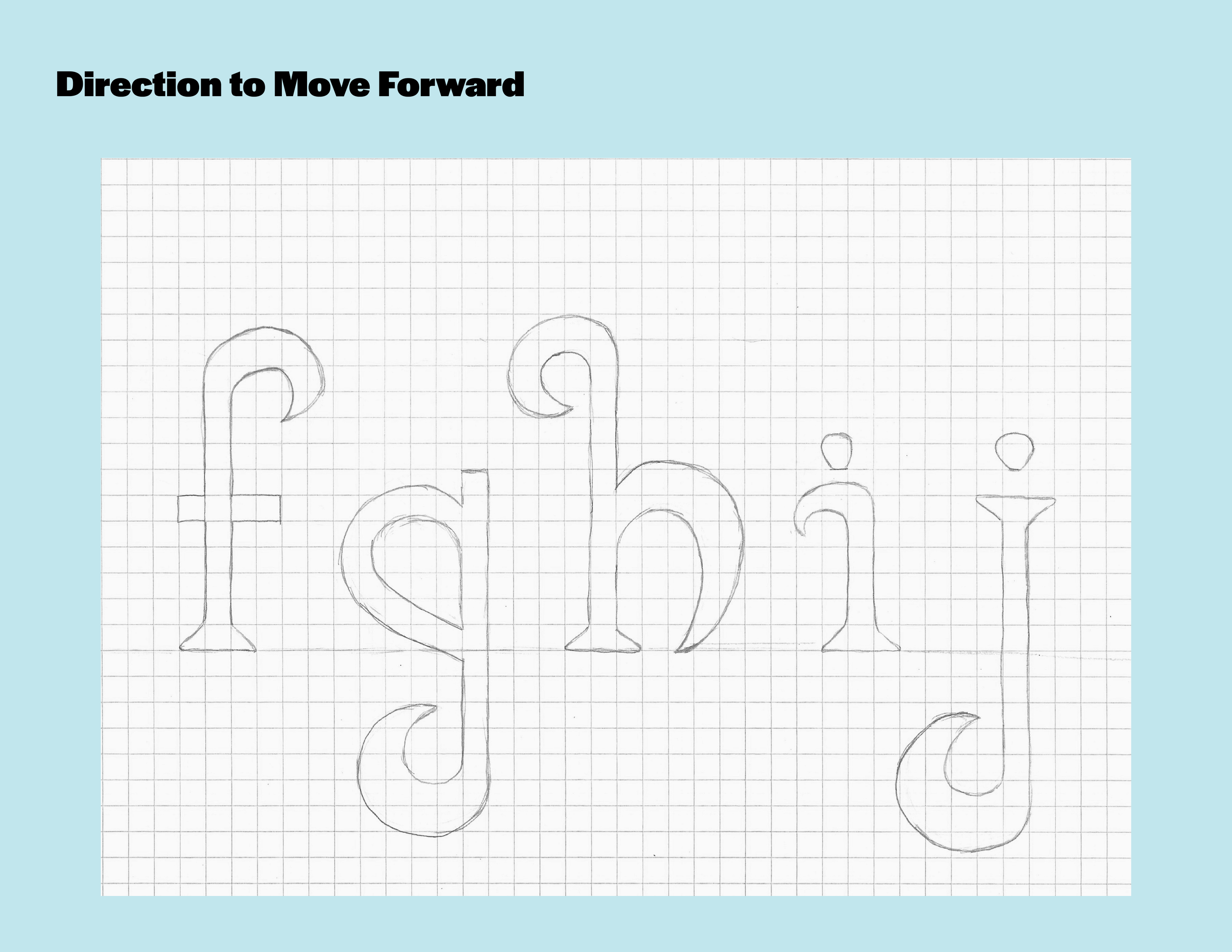
I decided to focus on the lovely little palm tree down the street. I love how the branches bend. I attached two pictures of the same tree. The lighting is different in both. The trunk even has its own little serif at the base. It just reminds me of a funky way to interpret a lowercase “h”. I also did f, g, i, and j.
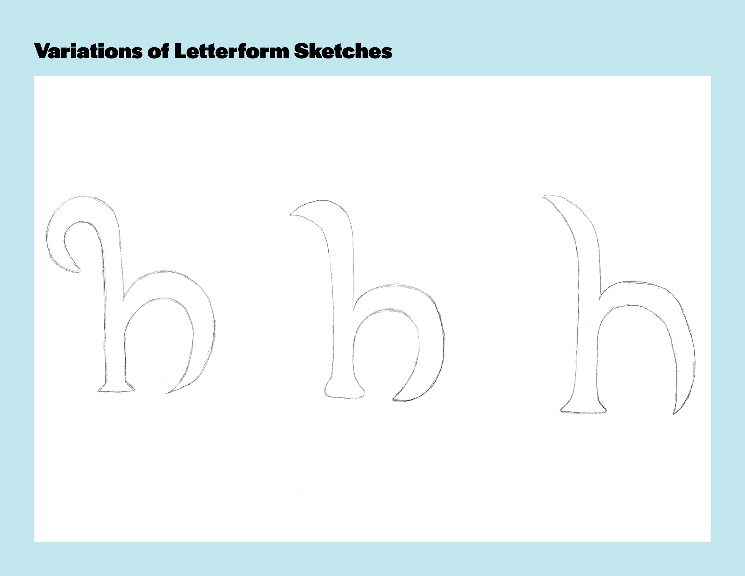
The way the tree is in the picture the trunk comes up and the branches bend not only to the left, but also to the right. I visualized this in different ways. First, was the way the palm branches hang. Second, is actually focusing on the fronds and branch shape. Third, is the shape of the thorns near the top of the trunk.
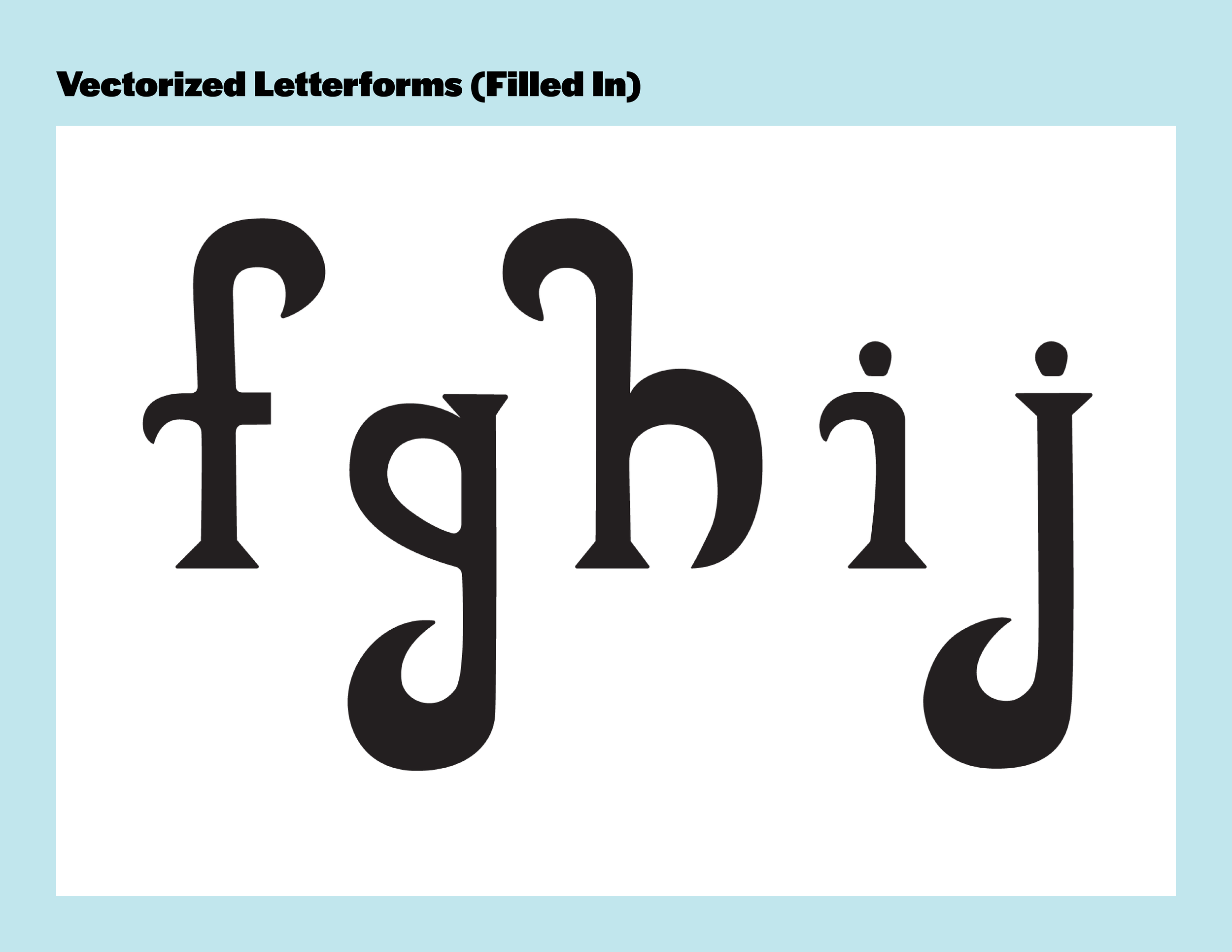
I have included the photos, the three versions of the “h” that I visualized in the process, the hand lettered version of “f, g, h, i, j” and the vectorized versions. The rest of the alphabet coming soon. :